2 Key Tips for Creating a Perfect Colour Palette
Colour can be your most powerful design tool if you know how to use it effectively. There are two essential things you need to know about colour schemes before you decide on your colour choices. These are both based around the colour wheel, which is the standard tool for combining colours and seeing which ones look good together.seeing which ones look good together.
DISTINGUISH YOUR EXISTING PRIMARY, SECONDARY AND HIGHLIGHT COLOURS
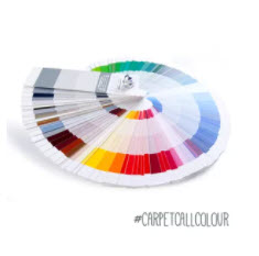
Primary Colour
This is the main colour in the room, which is used to set the tone of the space. It is usually a neutral shade like cream or brown, but can sometimes be a bolder choice like black, red or purple.
Secondary Colour
This colour is used to support the primary colour and is usually close in shade. It adds depth and dimension to your room without being too contrasting.
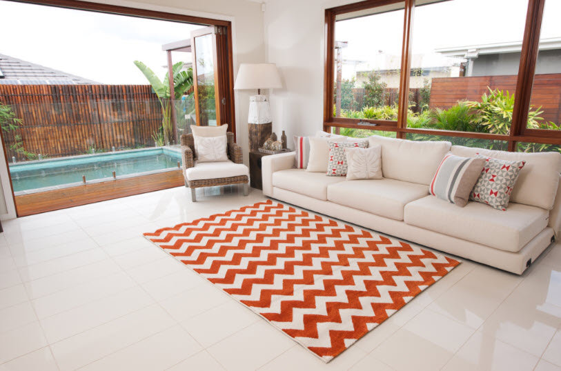
Highlight Colour
The highlight colour (or colours) is used to highlight specific features and draw the eye. It stands out apart from the primary and secondary colours, but also works well with them.
It’s important to have a versatile and workable colour palette of primary and secondary colours that easily accommodates different highlight colours, because it will allow you to change the look and feel of your entire room without having to change any crucial features such as wall colour and furniture. For example, you can easily transform the entire design and energy of a room simply by adding throw rugs and some matching cushions.
DECIDE WHETHER YOU WANT AN ANALOG OR COMPLEMENTARY COLOUR SCHEME
Analog colours
Analog colour schemes use colours that are side by side on the colour wheel, usually with one being predominant, one supporting and one accenting. Think red, orange and yellow. These colours usually match well and create comfortable room designs. Using primary and secondary colours in a room is usually an analogous colour scheme.
Complementary colours
Complementary colour schemes use colours that are opposite each other on the colour wheel and are great for making specific features really stand out. Think red and green, blue and orange, or purple and yellow. Their strong contrast creates a very vibrant look, and they are perfect options for highlight colours.
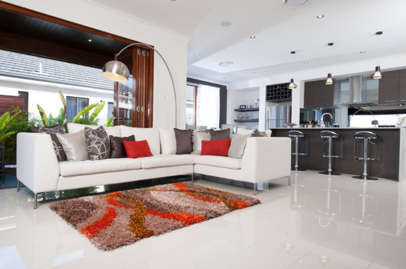
Once you have established the colour scheme you want for your room, you can choose one of our beautiful red, orange, yellow, green, blue or purple rugs online to perfectly match your design or bring a pop of colour.
Shop Carpet Call’s huge range of rugs for sale online to find the perfect addition to your room.
Blog Categories
Free Flooring Measure
Carpet Call takes the hassle out of new home furnishings by offering a free measure and shop at home service that brings our products right to your door
Find Your Nearest Store
Enter your suburb or postcode below to find your nearest store.


 Book Free Measure


